
NEW LOGO NATIONAL
EUROPE
By IFAB MEDIA - NEWS BUREAU - May 6, 2024 | 6 2 minutes read


Puig unveils the evolution of its visual identity as it marks an exciting new chapter in its 110-year history.
Puig, a renowned figure in the beauty and fashion sphere, unveils a fresh company logo that pays homage to its rich heritage while embracing an exciting future. Crafted in collaboration with the esteemed French art and design agency M/M (Paris), this redesign embodies Puig's enduring commitment to creativity and its intrinsic cultural values.
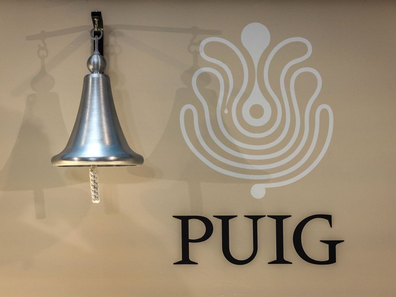
Incorporating the esteemed work of Swiss designer Yves Zimmerman, the logo revamp features a bespoke typeface called Paralelo. Drawing inspiration from Adrian Frutiger's Méridien, dating back to 1955, Zimmerman's adaptation for Puig over fifty years ago serves as the foundation. Complementing this distinctive typeface is a new symbol, evoking an infinite stream of creativity inspired by a Miró painting, while subtly paying homage to Puig's 1970s logotype, also masterminded by Zimmerman.
The motivation behind this makeover? According to Marc Puig, Chairman and CEO of Puig, the new visual identity seeks to reinforce the company's ethos as a "Home of Creativity." Designed to mirror Puig's dual dedication to tradition and forward-thinking innovation, the logo serves as a guiding light for its nurturing environment where brands flourish, individuals evolve, and daring concepts are celebrated. This transformative shift underscores Puig's strategic trajectory, seamlessly blending historical elements with contemporary design principles.
