


LACOSTE VISUAL IDENTITY BRAND REFRESH RENÉ LACOSTE ROBERT GEORGE CROCODILE LOGO TYPOGRAPHY HERITAGE DESIGN ARCHIVE INSPIRATION BRAND EVOLUTION GLOBAL
GLOBAL
By IFAB MEDIA - NEWS BUREAU - April 22, 2026 | 65 3 minutes read


Lacoste has introduced a new visual identity, drawing deeply from its rich archives and design legacy, as shared on its official LinkedIn page. The evolution reflects a renewed focus on the brand’s foundational codes, tracing back to the earliest creations of René Lacoste and the pioneering work of Robert George.
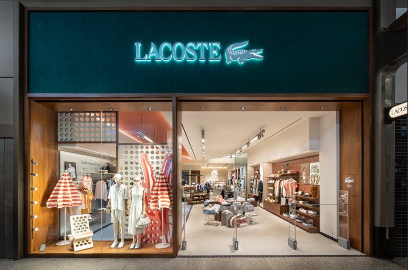
The refreshed identity reinterprets the Maison’s visual language with a refined approach, reinforcing its distinct positioning in the global fashion landscape. At the core of this transformation is typography, introduced as a key structural element. The brand has reinstated a strong serif presence through a bespoke typeface, meticulously designed with precise proportions, rhythm, and spacing to enhance visual coherence and sophistication.
Further enriching this evolution, René Lacoste’s handwritten script and archive-inspired motifs have been reintroduced, drawing inspiration from the brand’s sporting heritage in tennis and golf, along with its iconic Crocodile symbol. These elements extend into new creative expressions, particularly across packaging and brand communication.
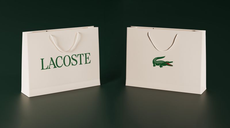
The Crocodile emblem, synonymous with Lacoste, is now more prominently positioned, with a visibly enhanced red tongue—an intentional detail that embodies the spirit of freedom and playfulness at the heart of the brand’s identity. Additionally, the signature green hue has been recalibrated to align more closely with its original tone, restoring a sense of authenticity and historical depth.
This visual evolution underscores Lacoste’s commitment to honoring its legacy while adapting to contemporary design sensibilities. By revisiting and refining its iconic codes, the brand continues to strengthen its identity, presenting a cohesive and elevated aesthetic that reflects both its heritage and forward-looking vision.
