NEW LOGO NATIONAL
By IFAB MEDIA - NEWS BUREAU - September 18, 2023 | 11 3 minutes read
Johnson & Johnson plans to introduce its new logo, color scheme, and font gradually across all company materials, product packaging, and branding assets in the coming period.
American pharmaceutical giant Johnson & Johnson (J&J) informed on September 14 that it will be updating its brand image. Marking over 135 years in the business, the company announced its plans to unite its meditech and pharmaceutical segments under the Johnson & Johnson brand name.
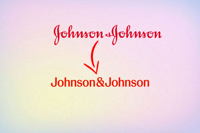
The brand asserts that the new logo is modernised, marking the dawn of its business' next chapter. The brand's iconic old logo, which has been in use since 1887, was based on the signature of the late James Wood Johnson (J&J's co-founder).
In its official communication, the company said that the new logo sees each letter drawn in one pen stroke, creating a contrast that delivers a sense of unexpectedness.
The company will use both the long and short-form versions of the logo, expanding and building more equity around a short-form ‘J&J’ to show up in a more personable, contemporary way—especially in digital interfaces. The new logo will continue to use the age-old red colour.
The new logo, colours, and font will be rolled out across all company materials, product packaging, and branding assets over time.
“Our Johnson & Johnson brand identity communicates our bold approach to innovation in healthcare while staying true to the care we have for our patients around the world,” said Vanessa Broadhurst, executive vice president, global corporate affairs, Johnson & Johnson.
“We take immense pride in leading healthcare for more than a century and are seizing on our scientific momentum to profoundly impact health for humanity.”
The company also announced a rebranding initiative that involves renaming its Janssen pharmaceutical business to "Johnson & Johnson Innovative Medicine" and its medical devices and technology segment as "Johnson & Johnson MedTech."


