

PRESENTABLE PRESENTABLE DIGITAL CREATIVES UPAMANYU DAS NAYANIKA BISHT DESIGN STUDIO GURUGRAM INDIA BRAND DESIGN BRAND IDENTITY PACKAGING DESIGN DIGITAL EXPERIENCES RETAIL DESIGN COMMUNICATION DESIGN LIFESTYLE BRAND DESIGN CELEBRATION DESIGN NATIONAL
GURUGRAM, HARYANA, INDIA
By IFAB MEDIA - NEWS BUREAU - September 29, 2026 | 296 20 minutes read





Something fundamental has shifted in the mechanics of Indian consumerism. The decision to buy no longer takes place exclusively in a crowded retail aisle or under the showroom lights; it begins on a smartphone screen, through a founder’s unscripted reel, a meticulously curated space, or a digital wedding invite shared across group chats. Design is no longer a superficial finish applied at the end of a business plan; it has become the core narrative through which modern brands live, compete, and command attention.
Recognising this shift, Presentable, an independent design studio based in Gurugram, India, has established itself as one of the country’s most compelling creative practices. Within just months of its launch, the studio’s work has earned international and regional acclaim, picking up features and awards across The Dieline, Pentawards, Packaging of the World, World Brand Design Society, Campaign Brief Asia, adobo magazine, Branding in Asia, Awwwards, and CSS Design Awards, among others.
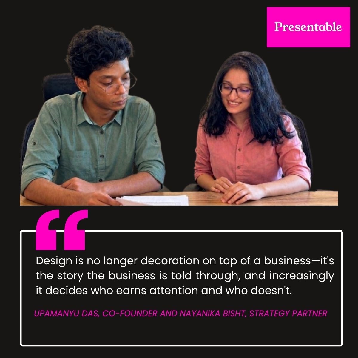
In an exclusive interview conducted by Gurbir Singh Gulati, Editor-in-Chief of INFashionBusiness.com, Upamanyu Das, Co-founder, and Nayanika Bisht, Strategy Partner, take us inside Presentable's philosophy, its dual focus on lifestyle and celebration design, and the strategy behind their award-winning project, vial.
.jpg)
Pic: Presentable’s award-winning design project, vial, reimagines wellness packaging through a modular, functional design language.
What inspired the creation of Presentable, and how does the studio approach design today?
Based in Gurugram, Presentable is an independent design studio operating across brand identity, packaging, digital experiences, retail environments, and communication design. The studio is structured around two dedicated practice areas: lifestyle brand design and celebration design.
The driving force behind founding Presentable was a fundamental shift in Indian consumer behaviour. Today, the initial touch point for a brand rarely happens in a traditional showroom or on a store shelf. Instead, a brand experience often starts with a reel showing behind-the-scenes craft, a founder detailing why a formula relies on six clean ingredients rather than twenty, a digital wedding invitation shared across WhatsApp groups, or a café that draws crowds purely through its visual aesthetic before anyone even orders a cup. Design is no longer an ornamental finish applied at the end—it is the narrative medium of the business itself, determining who captures public attention.
This shift is most pronounced in two specific sectors: contemporary lifestyle brands and Indian celebrations. Both industries are rapidly expanding, rely heavily on visual storytelling and word-of-mouth appeal, yet remain largely underserved by traditional creative agencies. Most design firms view a lifestyle brand as just another client on a roster, while treating celebrations as event decor and logistics rather than a serious design discipline. Presentable was built specifically to immerse itself in these two worlds rather than just visiting them on a project-by-project basis. Focusing on these core practices serves as a strategic focus rather than a limitation, anchoring a capabilities portfolio that spans branding, packaging, digital platforms, retail spaces, and communication design.
Could you share insight into the creative talent behind your design and animation work, including your hiring philosophy and the team's background?
Our studio brings together professionals from both formal design education and self-taught backgrounds; a blend we consider essential. Several team members hold degrees from institutions such as the School of Planning and Architecture and the Srishti Institute of Art, Design and Technology, with training spanning architecture, communication design, and human-computer interaction. This multidisciplinary grounding enables us to approach briefs holistically across various media. Alongside them, self-taught creatives bring distinct perspectives to the practice. Additionally, our founding team brings experience from working with global brands like OnePlus, Samsung, MakeMyTrip, Coca-Cola, Budweiser, and Unilever.
When evaluating potential team members, we look beyond surface-level trends, which quickly pass and are easily mimicked. Instead, portfolio reviews focus on fundamental design principles: typography, visual hierarchy, spacing, and the underlying conceptual logic.
During discussions, we focus on understanding a candidate's critical thinking. We often explore what decisions they would revise on past projects, points of creative friction they navigated, and their ability to simplify rather than embellish; as stripping away elements requires greater discipline than adding them. The team members who thrive in our studio seamlessly balance high-level strategic reasoning with precise technical execution, maintaining a deeper curiosity for the problem statement than the final deliverable itself.
What is the defining visual signature or design ethos of Presentable?
Rather than adhering to a singular aesthetic, we approach design as a systematic process. Everything begins with strategic insight grounded in market reality and user behaviour—examining how consumers interact with, discuss, and purchase a product, rather than aiming for what simply looks appealing in a portfolio. Visual style is then applied intentionally to serve that strategy, shaping how a brand influences culture, evokes emotion, and nudges everyday habits. The ultimate objective is driving behavioural change; the visual presentation is merely the mechanism to achieve it.
Because of this, we maintain a strict discipline regarding fundamentals: prioritizing structure over surface aesthetics, function over decoration and purpose over trend. Consequently, our visual output varies widely across projects. A traditional heritage jewellery brand may demand intricate detail, whereas a supplement package might require minimalist restraint, and both choices are equally valid. Style spectrums like maximalism or minimalism are intentional strategies rather than rigid identities. The constant across all our work is that every design choice must carry a clear, defensible rationale.
What makes Presentable distinct from other creative agencies operating today?
Our differentiation comes down to three interconnected advantages. First, our specialized market focus creates accumulated industry intelligence. While we design across various sectors, anchoring our work in contemporary lifestyle brands and celebrations gives us a deep, compounding understanding of consumer habits. Strategy is only effective when rooted in real-world behaviour, such as why a consumer trusts a health claim or what guests actually remember long after an event. By focusing deeply on these sectors, we build on existing insights with every brief rather than starting from scratch, grounding our approach in direct observation rather than guesswork.
Second, our work benefits from a cross-disciplinary foundation. Our team brings backgrounds in architecture, communication design, and human-computer interaction, disciplines that prioritize user movement and temporal experience over static visual appeal. Architecture treats spaces as sequential journeys rather than flat facades, while interaction design focuses on user action rather than passive admiration. This shared perspective enables us to design holistic end-to-end experiences, creating seamless connections across physical spaces, digital touch points, packaging, and print media.
Third, we maintain a cohesive, end-to-end methodological execution. Every project moves systematically from behavioural strategy to underlying structural logic, concluding with a custom visual language suited specifically to the brief. Because a single, unified team oversees the entire journey, the core strategic intent and creative vision remain fully intact without losing fidelity in cross-disciplinary handoffs.
How does Presentable define "good design," and what role does that standard play in how the studio operates?
Delivering good design is the core purpose of our studio, though we measure quality through utility rather than pure aesthetics. To us, good design isn't about fitting current visual trends or gaining internal praise; it is evaluated entirely by how effectively it serves the end user, whether it is intuitively understood, builds trust, leaves a lasting impression, and encourages repeat engagement. These are behavioural outcomes, which explain why visually striking work can sometimes fail in practice, while simpler solutions succeed effortlessly.
We view design fundamentally as a problem-solving process rather than an exercise in surface decoration. Every detail within a project must serve a clear purpose, and any element that cannot justify its presence based on real-world user interaction is discarded, regardless of how visually appealing it might be. Ultimately, true design excellence communicates a brand's narrative accurately and, at its highest level, subtly reshapes cultural expectations; redefining what audiences demand from a market category or how they experience a celebration. That transformative impact is the benchmark we continually strive for.
How do you view the evolving role of design in Indian brand building today?
The landscape is undergoing rapid transformation, primarily driven by changing consumer psychology. Purchasing choices have become deeply identity-driven—people select brands as expressions of who they aspire to be, making symbolic signalling as crucial as product utility. Furthermore, because digital touch points precede physical interactions, a brand’s visual story and online messaging usually form the first impression long before a customer handles the physical product.
This shift positions design as a foundational business decision rather than a late-stage polish. A new generation of modern Indian enterprises integrates design from day one, using it to define core product identity, market positioning, distribution channels, and brand recall. However, a traditional segment of the market still treats design as an afterthought, bringing in creative teams only at the tail end to apply surface-level decoration to predetermined plans.
Simultaneously, the role of designers is expanding from creative execution to strategic leadership. Designers who have spent years observing consumer decision-making and brand interactions bring crucial strategic insights to the table. Today, creative professionals increasingly focus on brand positioning and commercial metrics, with many leveraging these insights to launch their own ventures.
Which key design movements or shifts are currently transforming the market?
Two prominent developments are shaping the industry. First, identity systems are moving away from rigid, static logos in favour of flexible, adaptive brand frameworks. Modern brands operate across an expanding variety of physical and digital channels, meaning brand recognition now relies on cohesive overall visual logic and behaviour rather than a single fixed emblem.
Second, there is a distinct surge in aesthetic self-assurance among Indian brands. Rather than defaulting to homogenous, westernized minimalism, companies are actively embracing local cultural heritage; thoughtfully integrating Indic typography, vernacular scripts, and regional graphic traditions into contemporary visual languages.
Your identity and packaging design for vial earned widespread international recognition. What was the core idea behind this project, and why did it resonate so strongly with audiences?
vial is a brand identity and packaging system created for daily wellness products. The concept shifts multivitamins and nutritional supplements away from a standard clinical appearance into a deliberate daily ritual. The design utilizes a modular layout where each block corresponds to a specific nutrient, a functional color-coding system that informs rather than sells, a custom logotype derived from the main grid, and interactive checkboxes printed on the package so users can physically track their daily routines.
The project gained broad traction because it challenged a key industry norm: proposing that wellness packaging should prioritize the long-term experience of daily use at home, rather than focusing solely on catching a customer's eye on a retail shelf. This perspective resonated globally, securing twenty-five editorial features within months across publications like The Dieline, Pentawards, Packaging of the World, World Brand Design Society, Campaign Brief Asia, adobo magazine, Branding in Asia, and WhatPackaging.
.jpg)
Project Focus: vial — A Modular Design Framework for Daily Health
Traditional supplement and vitamin packaging typically relies on high-contrast colors, clinical aesthetics, and intense performance claims to drive retail sales. While effective for projecting authority on store shelves, these visual cues frame nutritional products as temporary treatments for physical deficits rather than components of a lasting, healthy routine. vial challenges this approach by adopting a clean, system-focused identity that replaces sales-driven urgency with structured clarity.
Functional Modernism in Daily Routines The visual system introduces modernist principles into home wellness routines—a concept with deep historical roots. Following the Indian government's invitation to Charles and Ray Eames in 1957 to evaluate design frameworks, their 1958 India Report advocated for utility-driven design, taking inspiration from the lota as an example of a humble, highly functional everyday object. vial applies this functional Indian design philosophy to modern personal care packaging.
 (1).jpg)
Drawing design inspiration from Piet Mondrian's grid compositions and the modular mechanics of Tetris, the visual framework uses basic geometric blocks to represent distinct nutritional elements. These blocks align, stack, or shift, creating a visual analogy for biological absorption, changing health requirements, and the evolving nature of personal wellness. This underlying grid directly defines the vial logotype, ensuring complete structural harmony between brand identity and physical packaging.
Information Architecture, Palette, and User Interaction
- Functional Palette: Color operates strictly as data, using distinct shades to differentiate specific nutrients while maintaining overall visual consistency.
- Streamlined Typography: Unadorned, structured typography establishes clear visual hierarchy without distracting from the primary geometric grid.
- Adaptive Geometry: Solid shapes represent foundational health support, while intentional negative space reflects the non-linear realities of personal wellness.
- Tactile Engagement: The exterior features built-in physical checkboxes. Users can mark off each dose, converting a static package into an interactive tool that encourages consistent daily routines.
By moving away from aggressive claims and focusing instead on systematic daily habits—mirroring how brands like The Ordinary transformed skincare—vial demonstrates how restrained, logic-driven design can reset category standards.
.jpg)
When building audience persona models for system-focused projects like vial, what core principles steer your research process?
We place far less emphasis on basic demographic data and focus instead on behavioural patterns and cultural context. Our research centres on the exact moments of interaction—whether that occurs on a retail shelf, a social media feed, or a kitchen counter. We map out the implicit expectations consumers have developed around a category, track where those perceptions originated, and evaluate what products individuals feel proud to display, recognizing that personal taste is shaped by social circles and cultural norms long before it becomes an individual choice.
Uncovering these insights requires a hands-on, meticulous approach. We dive deep into user feedback, focusing particularly on critical reviews, as customers describe their frustrations with far greater specificity than their satisfaction. We pay close attention to the informal language people use when discussing a product space rather than relying on industry marketing speak, and we carefully note which brand touch points users choose to photograph and share versus what they keep hidden from view.
.jpg)
By prioritizing real-world human behaviour over superficial ornamentation, Presentable highlights the growing strategic influence of modern Indian design. By treating visual identity as an evolving system and physical touch points as intentional moments of engagement, the studio is setting new creative benchmarks while helping shape a new era of culturally grounded, long-lasting brands. As consumer behaviours continue to shift, Presentable's logic-driven methodology provides a clear model for how design can influence not only brand presentation, but daily living.
Connect with Presentable:
Presentable
Gurugram, India
Website: www.makepresentable.com
Email: hello@makepresentable.com
Phone: +91 9211 643 524


